Scurvy
Scurvy</>
The data this week comes from the medicaldata R package. This is a data package from Peter Higgins, with 19 medical data sets for teaching Reproducible Medical Research with R.
The specific data set I visualised this week is from a study published in 1757 in A Treatise on the Scurvy in Three Parts, by James Lind. I would suggest taking a read of Peter Higgins’ post on the study, it’s quite interesting.
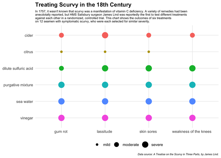
This data set contains 12 participants with scurvy. In 1757, it was not known that scurvy is a manifestation of vitamin C deficiency. A variety of remedies had been anecdotally reported, but Lind was the first to test different regimens of acidic substances (including citrus fruits) against each other in a randomized, controlled trial. 6 distinct therapies were tested in 12 seamen with symptomatic scurvy, who were selected for similar severity.
Of note, there is some dispute about whether this was truly the first clinical trial, or whether it actually happened, as there are no contemporaneous corroborating accounts.
I really enjoyed reading a little into this study and the data, especially the dosage for each of the treatments. I didn’t include them in the end graph, so as not to crowd out the information too much, but I’ll add them here, just for interest.
Also, worth noting: Based on this study, only one of the 12 seamen showed no symptoms after treatment - he was treated with two lemons and an orange, daily.
| treatment | dosing_regimen_for_scurvy |
|---|---|
| cider | 1 quart per day |
| cider | 1 quart per day |
| dilute sulfuric acid | 25 drops of elixir of vitriol, three times a day |
| dilute sulfuric acid | 25 drops of elixir of vitriol, three times a day |
| vinegar | two spoonfuls, three times daily |
| vinegar | two spoonfuls, three times daily |
| sea water | half pint daily |
| sea water | half pint daily |
| citrus | two lemons and an orange daily |
| citrus | two lemons and an orange daily |
| purgative mixture | a nutmeg-sized paste of garlic, mustard seed, horseradish, balsam of Peru, and gum myrrh three times a day |
| purgative mixture | a nutmeg-sized paste of garlic, mustard seed, horseradish, balsam of Peru, and gum myrrh three times a day |
I saw Nicola Rennie’s wonderful visualisation for this data set and wanted to set out to recreate something similar!
In terms of cleaning the data this week (it came with a lot of “_” and numbers), I familiarised myself with the stringr package, especially the str_replace_all() function, which was fun. Although, I struggled to apply this function for more than one variable to replace, so had to input manually.
At first, I thought it would be fun to use the geom_lime() function (each point is the shape of a lime on a graph), but realised I couldn’t map the symptom severity to the size of each lime so I scrapped that idea. I am on the lookout for a data set to use it on in the future!
I wanted to try out different shapes as a way to visualise the severity of symptoms after the treatments, but given there was more than one sailor for each treatment, it meant there was an overlap of shapes, which I thought looked confusing. For example, one sailor being treated with vinegar might still have severe gum rot while another also being treated with vinegar might only have mild gum rot.
While I ended up representing the severity of symptom by size, I wasn’t 100% happy with the outcome so I rearranged the y-axis so as to have cider and citrus (the two best performers) at the top.
Perhaps it would have been better to signify the symptoms of each of the 12 patients. Might be something to consider with a different visualisation.
