Hot Ones
Hot Ones</>
The data this week comes from Wikipedia articles: Hot Ones and List of Hot Ones episodes.
Hot Ones is an American YouTube talk show, created by Chris Schonberger, hosted by Sean Evans and produced by First We Feast and Complex Media. Its basic premise involves celebrities being interviewed by Evans over a platter of increasingly spicy chicken wings.
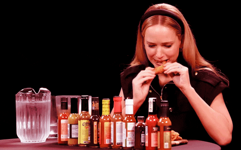 I probably watched way too many episodes of Hot Ones while creating this visualisation, which I’m not mad about. It’s a pretty funny show - I really just skipped to the end of each episode to see how everyone handled #10, the hottest wing.
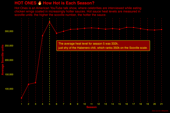
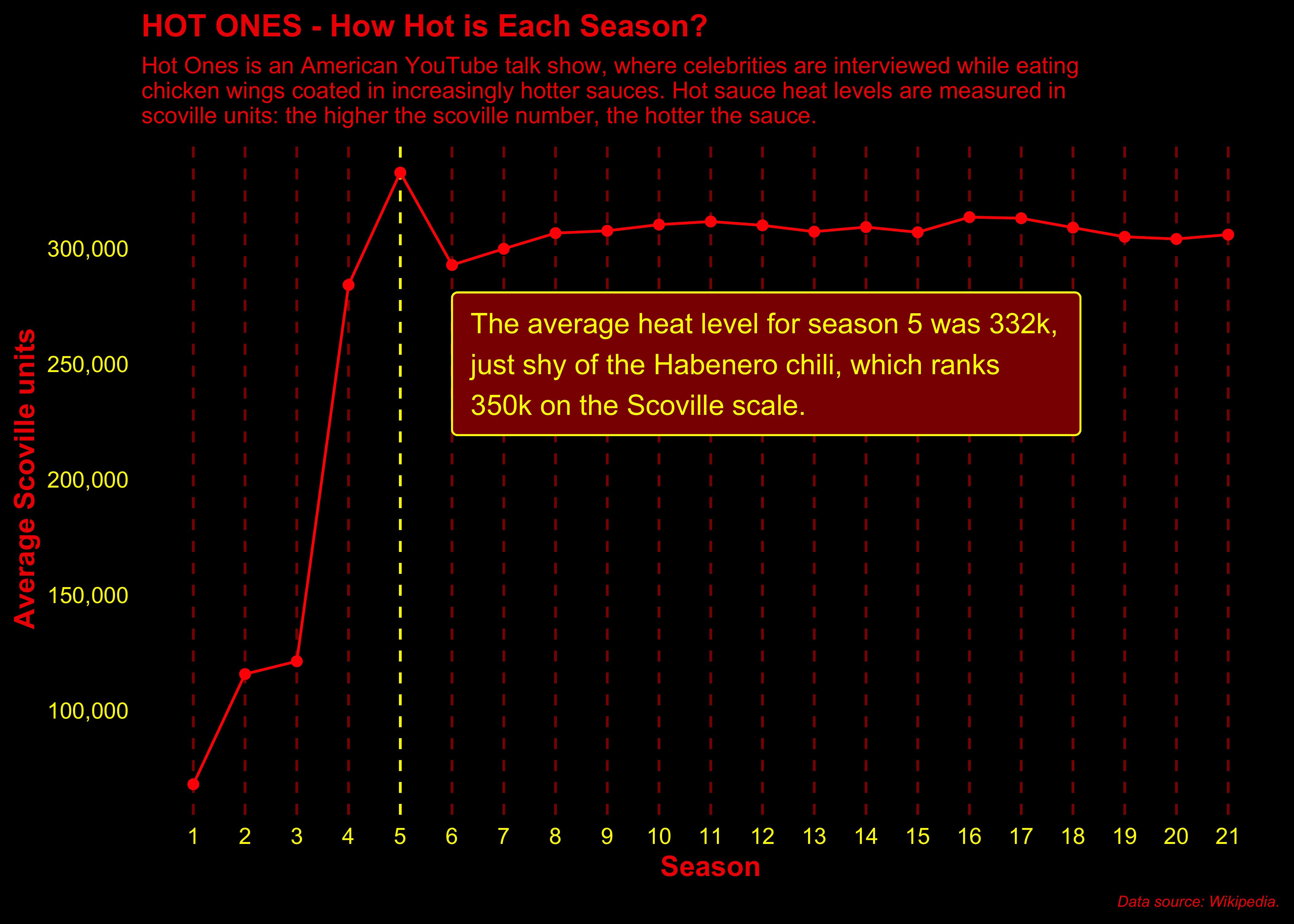
For my visualisation, I wanted to get an idea of whether the spice levels increased by season. Each season uses the same 10 sauces across each of it’s episodes so I didn’t need to worry about variation between episodes, just seasons. I used the sauces data to sum every 10 scoville ratings (equivalent to the 10 sauces used per season), averaged it out and then mapped to a data frame, which I used to plot my visualisation.
A point to remember: If I want to count every n consecutive numbers (as I did for this), I need to use colSums. If I want to sum every nth number, I need to use rowSums, but this will only work if n divides length(v).
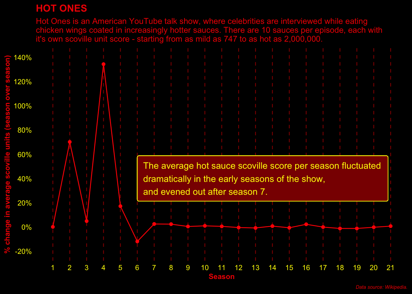
I originally wanted to see what the % change of the average scoville score was season on season, but when I mapped it out, it looked a little too complicated. I’m including it here for reference: